
|
(Fr. gris. grey) 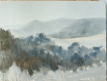 When I first heard this painting term I didn’t know what it was about. Was it something to eat, paint with, a look, a style, a pet to pat or a technique?
To define Grisaille, means to paint entirely in a monochrome, in a series of greys. While monotone refers to one colour, any one colour, grisaille refers to painting in a range of greys as the colour. So why paint a grey picture? Artists have often painted a grey blockin or underpainting. This then becomes the base to build a painting on top off. It is used to set the tones in a work of art. Google Grisaille in your browser and find images that show off artworks that have used this method. Be surprised at how old this technique is. Is this something that you do? It is rare these days to find an artist who creates a painting using this method. Has it gone out of fashion? Probably as we all rush for the quick way to do a painting. Traditional ateliers, some art schools and some tutors will teach this method today. A grisaille can be used for oil and pastel painting easily. As an underpainting and blockin it sets the tones for the artwork. It is a useful way to do a thumbnail before starting a painting to see that tones are placed to match the artist's intention for the work. So are you going to give it a try? I am, as it is a top way to get my tones correct at the beginning of the painting. Then I can match the colours to the tone of the underpainting. This is my start to my painting year with a Grisaille for my oil painting. A tip for beginners, watch those paint mixes! I mixed greys from two colours plus white. Burnt Sienna and Ultramarine Blue. I got to much of the Burnt Sienna onto my brush as you can see on the bottom left of the grisaille. When this is dry the next stage will see the local colours go on top. The painting will be built out layer by layer. If you do a Grisaille post it on social media do tag me in with @karoloakleyartist so that I can see your good work and cheer you on! Happy Painting, with best wishes, Karol PS: I have a micro course available on Tone In Art. It is short, informative and has downloads to use and learn with. Use this link TONE IN ART PRESENTATION MICRO COURSE. See if the course is right for you, read more about it and follow the prompts to go through and buy this short informative course. Members of The Online Art Society already have this in their Library and some of you may have done this with me as a live workshop earlier this month. Not a Member of The Online Art Society? Head on over to the website and read our story. https://www.theonlineartsociety.com/
0 Comments
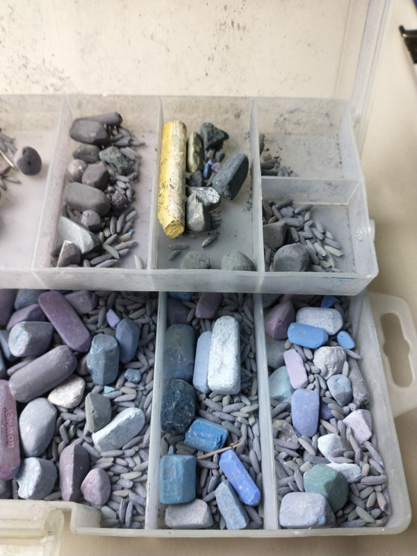
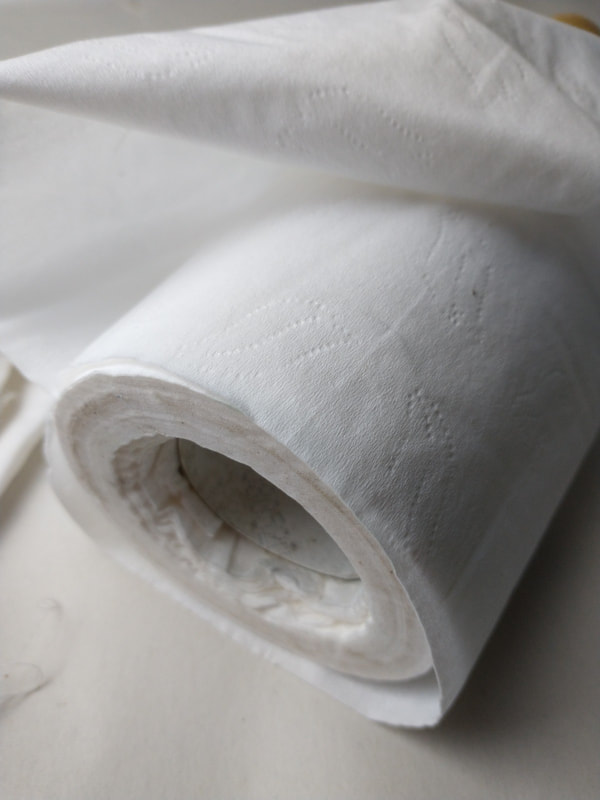
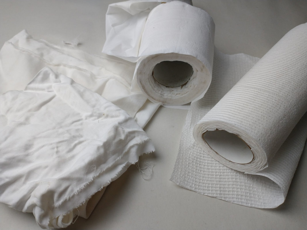
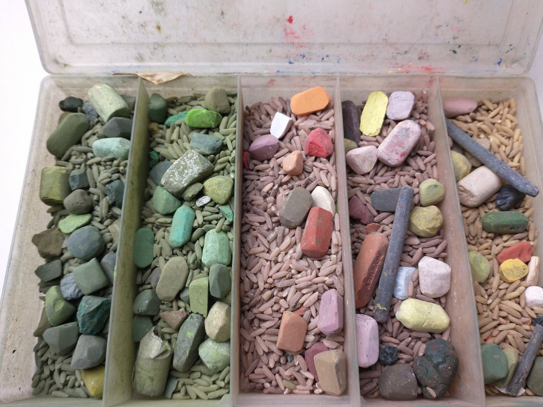
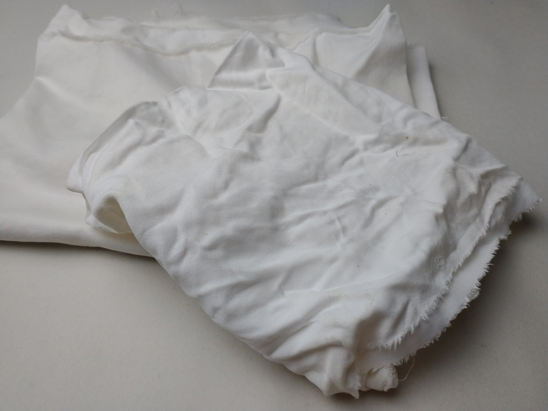
The subject of cleaning pastels often comes up followed by questions. Is it really necessary? Why do it? What do you use? How long does it take? How frequently to do clean them? Why clean them? for me its so I can see what the colour and tone is!! After a painting session they can get covered in dust and become unrecognisable except by shape. Another good reason is so as to not transfer grease from fingers, to pastel, to painting and watch it come back to you in ten years or so with a mould bloom on it. Clean pastels are easy to sort and put away. I like to clean my pastels after a painting especially if I am going on to a different subject. That way I can see the colour and tone family they belong to which makes picking a colour so much easier. If I'm staying say on beach scenes using the same pastels, I won't clean them and put them away. Rather just wipe them as I pick them up for use to make sure I don't carry any 'wrong' colour to the bit I'm working on. Cleaning pastels is something I do if I'm stuck at painting. You know that procrastination, wanting to start but not really ready ? Cleaning the pastels is a way to do something useful while I study the painting...or not! 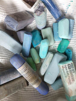 What to use to clean soft pastels? Here are four ways that work. Do watch out for dust as you clean them. Dust is a hazard and when we clean soft pastels we make a lot of it. So do take some precautions. These include an open window with the breeze going across your hands not toward you. Some wear a mask or latex gloves. Sounds over the top but the you have been doing this for a lot of years, experience says at least wear a mask. #1. Organic Cereals have been popular. Rice, oats and such can be used to keep the pastel clean. Try a lidded container with a layer of cereal about an inch in the bottom with the pastels laying on the top. I have a small travel kit with rice in it and many bits of pastel hiding amongst the rice. (See the photo below). This is a travel box for plein-air so the bits of pastel stay clean as its constantly moving. The rice in that container has been there for over 20 years. It still works. The one thing to watch out for is vermin. I have seen artists using this method, storing their plastic boxes in an outside area that's undercover or a shed. The rats have eaten the plastic through to get to the cereal, then eaten the pastels too. #2. Recycle Sheeting or Rags. Cut the rag into usable size cloths, no need to hem them either. Mine are about 10x12" so there is plenty of room to use. When finished I can put them into a bucket or washing machine, and wash them out for reuse, or just throw them out. #3. Toilet Paper/Tissue is easy to use, available, soft disposable and cheap. During Covid it was hard to get toilet paper so when I did get some I bought a studio pack of 10 rolls. I bought a cheap 2Ply brand. If it's embossed it can help clean faster and it's hard to get unembossed paper. Dispose of this in the bin or flush it. #4. Paper Towel brands mostly have a repeat texture that is helpful with cleaning. They are also tough. I tried paper towel across various brands until I arrived at one for my studio. I use it in painting too, so it has value, not just a one purpose use. For cleaning pastels it is a bit of overkill, maybe a bit over zealous. The question of how long does it take to clean them is arbitrary. Sometimes I draw out the process and other times it's a quick wipe through and keep it moving. I clean fairly regularly, as I go along painting by painting so its not a huge job. Remember to keep you hands clean and the dust away from your face when you do this job. What is your go to cleaning item and routine? Share it here or drop over to the Facebook group Pastel Secrets and share it there. www.facebook.com/pastelsecrets Not a member? Easy! Just ask to join, answer all three questions and agree to the group rules then you are in. When it comes to soft pastel painting our pigments are just there ready to use. Most of us pick up a stick of pastel and get to painting. I wonder how many pastellists read the labels on the soft pastel sticks? The label has not just the manufacturers colour code and name but also the lightfastness rating of each colour. Now some colours are what they call fugitive. This means that they will fade over time. How long that time is and under what lighting conditions is determined by this test by the ATMS - American Testing Materials Standards. It has been a long time coming and thanks to IAPS we now have this available for all soft pastel artists to learn from. They have a video to share from YouTube about the testing and the results. It is surprising to see some of these results. Use the link below to view the video. We have a discussion going about his subject over on the Facebook group page Pastel Secrets. It is free to join. 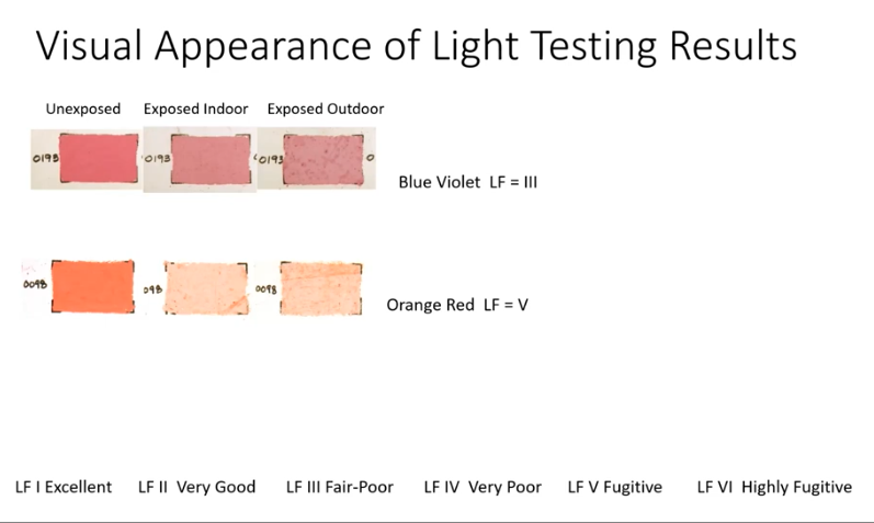 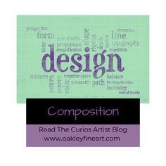 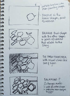 Blog No.6 Composition, made up of balance and design in a painting, are there to help tell the story you wish to share with your viewers. This is done in the artwork deliberately and with thought, so as to lead the viewer through your visual story page by page, which translates as point of interest, by point of interest. If we think of creating a painting in terms of a book layout we can use the analogy of each point of interest being a page. How many pages in your story, how many points of interest, what frequency, how close together or far apart are they, how connected are they, big print pages or small print pages, are they loud or rather quiet? When we design paintings to tell the story, we use the balance of these points of interest or pages in our design. We locate them across the 2-D surface in a path or pattern to take the viewer along the story. Some artists will wing it some artists will plan it. ( the layout of the stories). I tend towards the latter layout of the stories. When I have a photo reference my first question is what do I love about the subject? What drew me to it in the first place? Was it colour, light, texture or symbolism or something else? All are valid reasons when an artist goes 'ooohaahh’ at first sight of a subject. Once that something special is established make a note to yourself about it. Refer back to this so that you're not getting lost or jumping all over the place as you build your story out from this one main point. Use composition aids to guide the placement of other points of interest, or pages of your story, to take the view on that journey. More on that below. Ideally do a sketch in the shape of your painting support's shape. Landscape, portrait, square or however it will be when painted. In the drawing series shown here, the support is a landscape shape. Doodle in shapes to represent your story, keeping in mind your number one love in this story. Make that the star of the page...big and bold with the best placement on the page. Balance that shape with other shapes that relate to the story. Tie them together with visual clues like line & light. Is it balanced? Can you take the viewer through the design using colour, edges, tone, texture etc. There is so much more to explore on the subject. This is food for thought something to get you thinking about your painting design. So what are these compositional aids? The rule of thirds, is the simplest to use. It is about dividing up your painting into nine areas of equal shape and size. I used pink here in the drawing below, to show the thirds along each edge of the 'paper' and then across to intersect making the nine boxes. 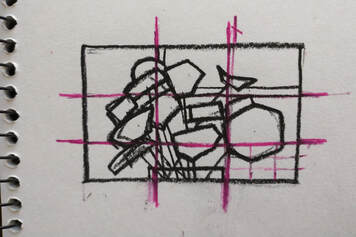 Where those boxes touch is an ideal point for placing the story points, your points of interest.
Remember only one of these intersecting boxes is the main interest point. The rest lead in and out of the painting to support your main point. Think of them as the cast in your story. Have a play, use this as a guide to see what you can come up with for your next painting. Try doing the doodle with the with the one third lines predawn and fit your shapes to touch them or be in the boxes. Simply divide the top of the paper and the side of the paper into thirds. Copy these across to the other side and join them up. You can see where I miss aligned on one of the third lines on the top of my paper shape. It was crossed out and redrawn. So long as you are happy and satisfied with the balance of the now composed painting that's all that should matter. I go with the feeling of the composition, has it shown off my main point of interest, is it balanced, does the sketch look like a finished painting could be made from this that shows of the one main thing I love about my subject? Happy Painting, Karol  Blog #5 Composition Wing It or Plan It?
It can be argued that a planned composition kills creativity. If we think about this, the artist who wings it, goes straight in and paints. These artists don't think through or plan their composition. Some people call this fluking it, others call it amazing or a true artistry. Consciously they don’t, subconsciously they do think about planning the composition. The ability, the knack of getting a painting balanced and looking right belongs to both an artist who plans, as much as it belongs to a ‘fluked’ result for any other artist. As artists we have a tendency to see, feel, know, what looks right. It is an innate skill. When we take photos we compose through the camera lens. This isn’t a conscious or deliberately thought most of the time, we are not voicing that we are ‘composing that shot’. In saying this, there are some who do, who deliberately do just this. They plan and compose the shot ready for a painting reference. That photo reference is usually copied exactly how it was taken, into a painting. Why? It looks right, and its got all the info needed for a painting. The answer to composition here is to wing it, go with what’s up front, ready to use. Artists with perhaps more experience will take that reference photo and pull it apart. They will do some thumbnails sketches to find the best composition, that tells the story, that shows the viewer what they saw and felt at the moment the photo was taken. The structure of the painting is designed to be balanced, it is composed. Usually small thumbnail size sketches are the method for this sorting out of the design. They are quick and too small to include details. This is planning it. So do you wing it or plan it? How do you go about planning for your painting? There are aids available for composition in the form of apps to use on the camera phone but first of all the artist needs to understand the rules of composition and how they can work. Are you going to do something toward learning more about composition? Best wishes in your painting endeavours, Karol  2022 Blog Post #4 Finding Photo References Where do you get yours? Most artists will take their own photos of subjects they want to paint. Sometimes it might be a random drive with the photographing of a subject in nature that is oh wow. I tend to call these a 'drive by shooting' while not 'politically correct', most of us know what I mean! I know of one artist who took a day trip on a train through the country to take photos of the landscape for reference. Some will take specific photos at times of day or seasons to use for a painting. A purposeful destination for a reference gathering day out is fun too. So what if you can’t do this? Not everyone has the mobility or freedom to go out taking photos or even plein-air painting for reference material. We can ask friends and family for the use of that great photo they took. Most times it is better left as a photo than used for a painting, as that’s why they took it in the first place. Artists tend to see the subjects differently and so look for photos that translate as paintings, photos that has elements of light and dark, bright and dull etc. The references we use must be ones that we are sparked by, that fire us up, or sound some kind of delightful bells in our hearts. They are relatable and inspiring. So don’t use ones by family and friends unless they are on the same wavelength as you are, their photos light you up and you can see a painting in them. There is also the issue of copyright. Now this is definitely one for you to go and do your own research on. Each country has its own rules. Artists need to understand what the rules are and abide by them. I hear so many beginning to mid stream artists say that if they change some one else’s picture just by 10% then its no longer copyright infringement. Believe that and loose your house. Do the homework. I encourage you to ask questions from the correct information places, get clear on what you can and can't do. Even the pic that Aunt Mary wants you to paint...she will own the copyright on that image, which dictates what yo can and can't do with it. Art shows often ask for the artist to be able to show that the references that used are their own. So that is why this article is about finding your own references, or references that are given free to use rights by the owner. Search that one out too. Type it into your browser and sew what information comes up. Artists need to take responsibility for the integrity of their reference photos. Just Googling a reference photo is not on, that could lead to a copyright infringement and can get you into all sorts of trouble. Some online companies tout free to use images. This is a bonus for those who can’t get out to take photos….or is it? The ones listed below have free to use images. These may have special licensees attached to them so that artists can make any sort of artwork from them without the need to get permission. Make sure you read the licence, and know where you stand. There are sites on Facebook that offer 'Use My Reference' for a painting. These are terrific places to source painting reference material. Have a scroll through Facebook to find these sites Do remember though that some photos are better left as photos. Be guided by your integrity. If it looks suss it usually is. Question the site offering the free to use reference photos. Ask what are the limitations? Are they offering only references to learn to paint from? What happens if you sell the work? What happens if you keep the work as a practice piece? Can you use these images in a workshop? Can you show but not sell these paintings done from free to use images? Ask questions, get the answers and know that your reference photo is good to use for the purpose you want. I know it is a struggle to get great photos to paint from. Look for other ways to get them. Maybe your art group has a meeting to swap and share their pics, copyright free. Artist friends can often give each other great reference photos. Be imaginative and stick to the simplest, most honest ways to get a reference photo. That day train trip is looking good especially if it is with artist friends!! All the best in your painting endeavours Karol These are some of the sites that have reference photos but check out the 'rules' and the licences of use. Internet sites: www.unsplash.com www.shutterstock.com www.pexels.com www.pixabay.com Facebook: Free to Use References for Artists __________________________________________________________________________________________________________ Courses on pastel painting: www.onlinepastellearning.com www.theonlineartsociety.com home for artists of all media to connect, learn and be inspired. Membership is monthly or annually. Want to know when the next post arrives? Join our announcements list with your best email so that we can stay in touch.  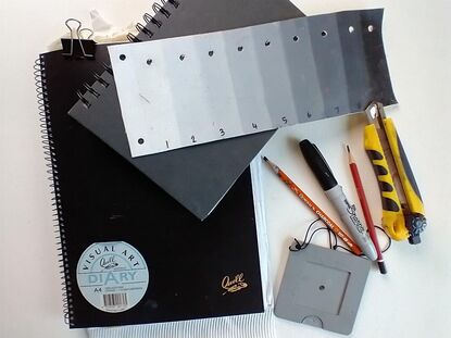 Blog Post #3-2022 Tone is a subject that most newish artists know about, but don’t fully grasp how powerful a painting tool it is. As one of our painting tools, it is I believe, the most important. When a painting lacks tone it lacks depth, unless the use of similar tones is the desired result. As an art teacher I have seen so many students give tone a miss in favour of colour. They do colour well enough but have no regard for using tone, how powerful a tool it is and how it can carry a painting. Ever heard the saying that ‘a painting can have all the weird colours it likes, as long as the tones are correct it will hang together and read well’? Art schools still teach black and white drawing first, for a reason. We all moaned about getting to use colour but until tone was understood and used proficiently we stayed working in black and white. I had the good fortune to attend a private atelier where my teacher was trained in just this method of painting. Tone was reinforced as the way a painting was modelled, by creating tones and sculpting the 3D form in paint on a 2D surface. So why is tone so important? Tone is the muscle of the painting. If you take my analogy that “drawing is the bones, tone the muscle, skin is the colour” then it gives a useful image to relate to. Designing a painting to hang together means it needs to be supported by the other parts of the skeleton. Get the bones in the correct position, the muscle to do the heavy lifting and the skin to glow and shine. We sculpt these muscles in paint or other media, by using lights and darks. Tone is described as the change of light, going from dark to light. To see this in painting terms, tone is shown on a bar, in a scale format, usually from 1-9. With No.1 being the lights at white, while No.9 being the darkest at 9. Tone is also referred to as value and so we have tone or value scale. Tone can be referred to as shades and tints. Again we are dealing with light and dark. When a tone is said to be tinted it means white or light is added. When a tone is said to be shaded it means that it has black or dark added. On the 1-9 tone bar the middle box is denoted as No.5 or tone/value 5. As the tones go up the bar toward black they are shaded with more black or more dark. From tone 5 going down the bar it is tinted with more white or light as it progressed toward No.1 at white. When an artist understands how this relationship of light and dark works in a painting, then they are able to associate colour to tone and can move on to using light and dark colours, or toned colours to create with. As my teacher, Nan Paterson said “learn your craft then practice your art”. So my artist friend, get out there and see what tone or value is all about. Learn as much as possible by practicing with it, get to understand how it works for you, as the muscle in a drawing or a painting. best wishes, Karol Want to know when the next post arrives? Join our blog alerts announcements list with your best email so that we can stay in touch. Fill in the form at the top right of this page. 😃 Need to make a tone bar to help understand the use of tint and shade/light and dark? I have mini course available that walks you through making a tone/value bar for everyday use. In fact I make two in this video series, one for plein-air and one for the studio! Go to www.onlinepastellearning.com for this mini course using oils or pastel or acrylic. Membership Group for artists of all Media: www.theonlineartsociety.com home for artists of all media to connect, learn and be inspired. Membership is available by monthly or annual subscription. 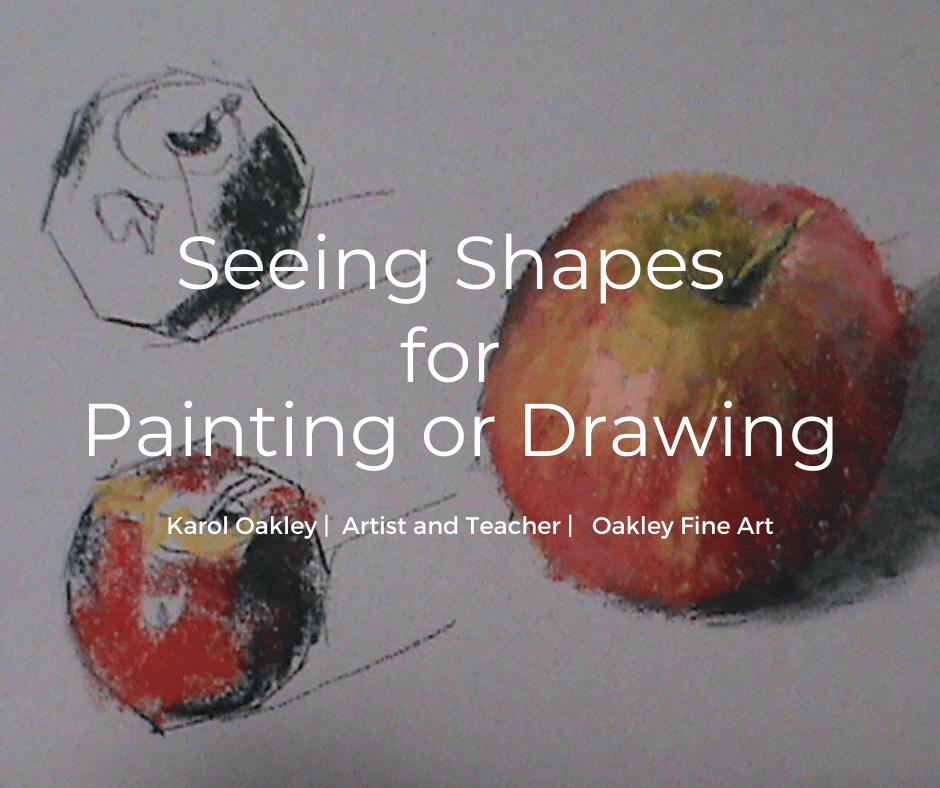 Seeing Shapes in our Painting or Drawing Subjects.
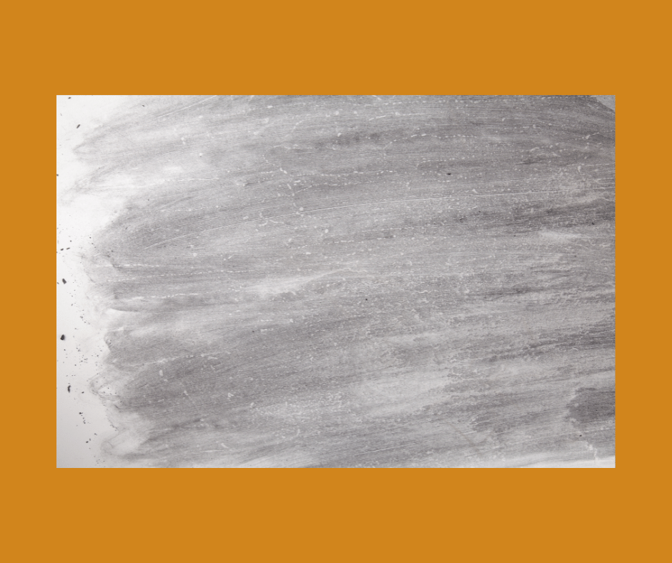
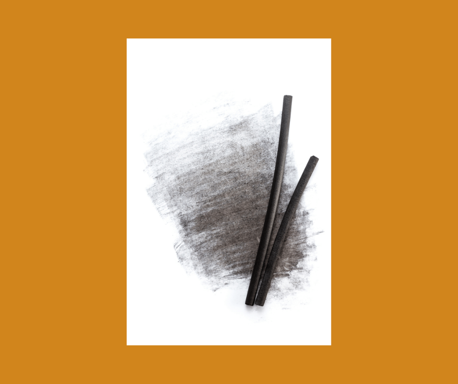
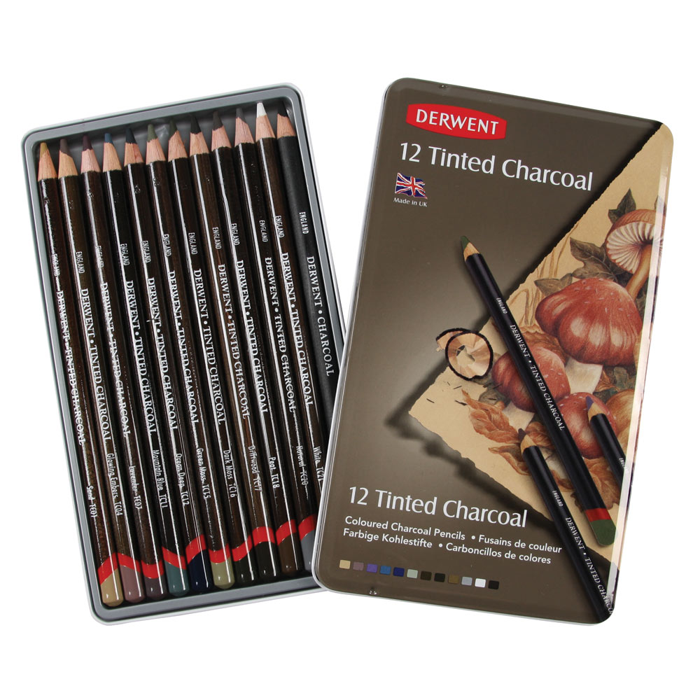
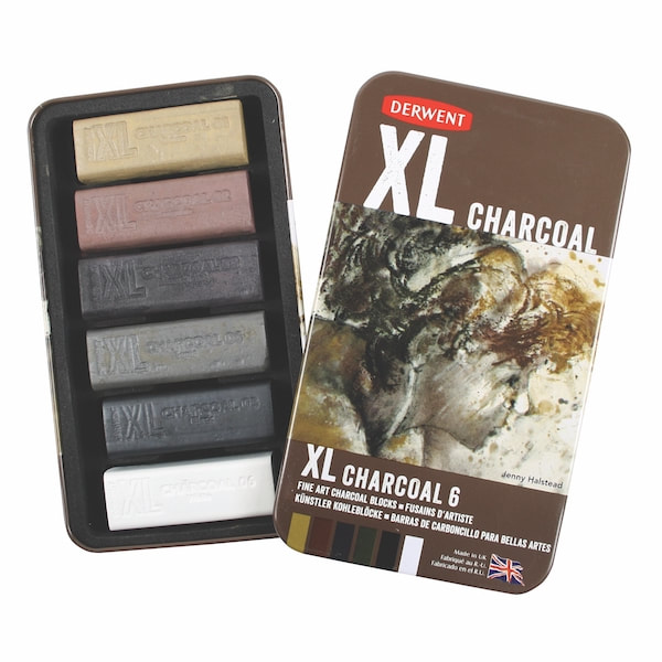
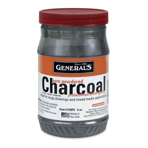
As an artist it is really useful to be able to ‘see ‘our subject in terms of shapes. But just what does this mean? Some visual artists can see the world as a series of intermingled or separate shapes, like a circle, square, rectangle, a free form puppy in the clouds, you get the picture. This is an inherent skill, it’s natural to them and makes the painting process quicker and simpler. Most of us are struggling to grasp this concept let alone see shapes in our world. We have to learn to see shapes, learn to identify a shape of ‘something’ tangible. For instance, learn to see that the distant hills are all one shape, maybe a long rectangle, unified by a colour/tone. The ability to break down what we see into shapes helps with the painting process. When we can identify the distant hills as a separate shape then we can assign the painting tools of tone, colour, temperature, edges, design and composition to them. If we explore the idea that every object has a tone and colour, then every object has a shape. A single tree in the landscape is one shape. It might be as a child sees it, a lollipop, a stick with a circle or triangle on it. Then develop this idea further in a group of like trees with the same or very similar tone and colour, can be looped together to form a new shape. I refer to this as ‘lassoing’ a like group of objects, together, into a free form shape. Imagine how this shape mapping would help with drawing up a subject! Have you ever seen a cartoon drawn up ready for tone and colour to be added? Not a Mickey Mouse caricature cartoon type, but a regular drawing up done for a painting. (It is called a cartoon.) ‘Cartoon' first designated “a design, drawing, or painting made by an artist as a model for the finished work.” https://www.merriam-webster.com There are two painless ways of shape mapping that I encourage you to explore. 1. First is by squinting. Close one eye and half shut the other while looking at the subject. Note how parts of the subject, are distinguished only by tone. These parts can become a shape identified for the painting. Give the shape a name or a number, either way it is one recognisable part of the overall puzzle of shapes that make up a subject. 2. Second is an easy way to get to grips on this concept. Take a black and white paper print of a landscape that has some elements in it. Elements like a distant hill, middle hill trees, rocks etc. A reference photo that has some depth that would make a good painting. Then with charcoal or a biro even, have a go at linking, or ‘lassoing’ ‘like areas’ together into a shape. Remember these 'like areas' are similar in tone and colour. See what you could call that shape, say long rectangle, triangle on a stick…. Once you start to see how this works doors open, lights go on and ahh ha moments happen. A whole new world of painting just got simpler. I am one for asking why and ‘let’s see what happens if’, giving myself permission to go and be curios. I believe that curiosity fuels creativity. Ask yourself why and how and see what happens!! Use this concept of shape mapping in your planning for a painting or drawing. Use it to sort out tones and colours for your painting. Or simply to draw up from. Tell me how it works for you! Want to learn more about shape mapping? www.theonlineartsociety.com/ scroll down to the bottom of the front page to view our course about Thumbnails Sketches. Shape mapping is explained and demonstrated as a part of this course. Want to know when the next post arrives? Join our announcements list with your best email so that we can stay in touch. The form is on the top side bar of this page. www.theonlineartsociety.com home for artists of all media to connect, learn and be inspired. Membership is monthly or annually. 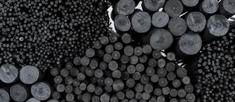 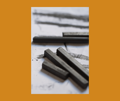 Blog Post #1 Charcoal As artists we are spoilt for choice when it comes to charcoal varieties. This organic substance has been used since caveman times and is considered the oldest drawing medium known to man. There are three modern types of charcoal we can buy: 1.Compressed 2, Vine or Willow 3. Powdered 1. Compressed charcoal Compressed charcoal is powdered vine or willow charcoal with a gum or wax binder added and formed into blocks or rounds. It is also formed into thin rods that are encased into wood and sold as pencils which are then easy to sharpen to fine point. There are grades of compressed charcoal from soft, medium and hard. The more binder the harder the charcoal which also determines how light or dark it is. The less charcoal powder and more gum or wax the lighter it is in tone. The binder in the mix of powder determines the degree of hardness or softness hence, lightness or darkness. It is suggested that beginning artists go for medium grade, long sticks and break into short pieces. Use these short pieces for a variety of strong to light tones and thin to thick lines. The compressed charcoal gives deep, dark blacks that Vine or Willow by its very nature cannot. This charcoal also doesn’t erase from the paper. 2. Vine or Willow What’s the difference between willow and vine charcoal? In general, you can say that vine charcoal is a bit lighter (greyer) than willow charcoal. Vine charcoal is slightly harder than Willow, it is more difficult to erase and has a slightly oily feel. Vine is thinner and straighter than willow. Willow has a range of thicknesses available and has more knots in the sticks. These knots may be annoying or accepted as part of the idiosyncrasy of this charcoal. The knots mean that they can break more easily or kinda get bogged by changing density. In using either of these, you will see that overall, the difference is not that great. Willow branches or grape vine sections are stacked into an airless kiln and slow heated to make carbonised wooden sticks for drawing. These contain no binder, so they are powdery soft and at the same time brittle. Press to hard and the stick will snap! Willow or vine charcoal sticks make a wide range of marks, thick and thin that can be easily erased. Use a putty eraser as a drawing tool. Using these sticks gives more control, more delicate nuances, they can be powered and applied with a brush, create gradations and delicate shadings. It’s good to be remember that willow and vine charcoal are natural or organic products, and their properties (colour, tonal value) can differ from each brand, and also across every batch. Explore the different brands and see what happens, explore, and see what works best for you. 3.Powdered Charcoal Powdered Charcoal is simply Vine or Willow, or a mixture of both, (brand specific) crushed into fine powder. It is sold in jars or pots ready to use. It has no binder in it and so stays soft and somewhat lighter than compressed charcoal. Layers can be built with this powder, and it can be drawn into with charcoal sticks or pencils. This powdered form of charcoal is used primarily for large areas of layering in tonal values which can give a base to work on with a soft and delicate look. Traditionally used in drawing, the charcoal powder can be applied, erased, and manipulated in different ways. Such as with a brush, wet or dry, blending with a torchon or paper towel, erasing into it. Poncing is another method which uses powdered charcoal. I encourage you to look that one up as it might be a method that you can use in your art. Other Styles of ready to use Charcoal Highlight Charcoal Pencils Highlight pencils sold as white charcoal are not really charcoal but some kind of chalk. They are not like pastel pencils which contain white pigment. They work with charcoal to add lights. Charcoal Pencils These are charcoal rods encased into wood for ease of use and sharpening. Pencil charcoals come in different sizes and weights and density, from soft to hard. They may consist of compressed charcoal, powdered Willow or Vine charcoal. Check the labels and ask questions. Tinted Charcoal Tinted charcoal refers to regular charcoal sticks and compressed sticks that have the binder tinted with a touch of coloured pigment. These vary across brands as some have more chalk in them or more binder/gum to create shades of grey. They may be in pencil or block form. Do a little exploring and see who used charcoal to make great drawings. I encourage you to satisfy your curiosity and see just what can be done with charcoal and how it may work for you in your arts practice. Charcoal isn’t only for portraits. Search out charcoal landscapes from the 19th century, still life and animals. Check out the great artists who used charcoal; from John Singer Sergeant to Leonardo Da Vinci to modern day artists like Lynn Howarth, Caesar Santos and Harley Brown. I haven’t touched on brands within these three groups. There are so many out there and each one will work differently, as well, as how it works on different paper styles. There are plenty to discover and maybe there is one that jumps out for you to try. For example, a drawing project with Guest Artist Lynn Howarth from Scotland, at The Online Art Society introduced us to Nitrate brand charcoal. So, get going, try before you buy, ask your art group friends or at your local art shop too. Give this medium some attention and use it in thumbnail sketches, drawing up for a painting, or do a whole drawing in charcoal and explore its unique appeal. Post what you do on your social media and tag me in so I can see your creation!! My tag is @karoloakleyartist Want to know when the next post arrives? Join the announcements list with your best art email. Need to do a course? Check out www.onlinepastellearning.com/ Looking for a community of artists who encourage and support each other while making progress with painting? Check out www.theonlineartsociety.com/ Well that got us all talking.
Thanks so much for your reply and insights into the Canson Mi-Tientes paper. The discussion about this paper and its uses is still going on Facebook. There were a lot of comments and ideas sent back so I wanted to share some of them with you. I won't name names! As I said in my last email , Canson Mi-Tientes paper is an old favourite of mine. I have been using it again lately as I put together my next course, an Introduction to Pastel for www.onlinepastellearning.com Talking about this paper in the course was what prompted me to ask you which side was the favourite. From all the replies the winner is the smooth side. It is agreed that more layers can be pastelled onto this side. Interestingly some pastellists had not tried this side using the textured side instead, now they are going to give the smooth side a go. Another interesting thing to note........ Canson Mi-Tientes paper is used for portraits mostly, animal and human. It is easy to see why with a good range of colours (up to 50) to suit any background. Oh yes these portraits are painted on the smooth side too. The rough side gets a poor wrap. The texture showing through the pastel is off putting was the recurring comment. Some liked it for the texture as it helped describe a specific subject. This paper is used by artists as it is low in cost and good value. There are so many papers out there now for pastelling we are spoilt for choice. Some papers may seem expensive but is the value in the strength, quality, tooth that makes it worth buying? I like to experiment and try new things and yes it is costly so I have to save up for that trip to the art shop. Maybe it's worth sharing with a friend to go halves in a sheet paper to try it out. As one friend said treat it likes a cup of coffee. $5 a coffee, two coffees for a sheet of paper. To answer one question, no I don't know how Canson Mi-Tientes is pronounced! I asked at the art shop and got three different answers from three people. Then with my Australian accent the French sounds sad! Can any of you tell me the phonetic pronouncement ? So there we are, somethings we guessed at, some new things to think about and some tips. Happy painting, Karol ps if you want the latest blogpost in your inbox click the RSS Blog Feed button on the right of this page. :) |
The Curious Artist Blog-
talks about everything and anything to do with painting. It's my aim to share techniques, tips, tricks, adventures, products, paintings, educate, inspire and foster the appreciation of painting. I welcome your feedback and questions and don't promise to post regularly, but to let you know when I do post . I'l give it my best shot to answer your questions and if I can't I'll let you know. Gee I may even be able to give you the name of someone who can answer. Either way this blog is about art, artists and everything to do with painting and drawing, being informative, heck maybe even inspiring, all aimed at making painting enjoyable. I sincerely wish you to join me on this adventure. best wishes, Karol AuthorKarol Oakley Archives
February 2023
Categories |

 RSS Feed
Karol Oakley is a Professional Artist and member of :
The Pastel Society of Australia (PSA)
Australian Guild of realist Artists (AGRA)
National Association of Visual Artists (NAVA)
Pastel Society of Southern California
PROUDLY AUSTRALIAN MADE
Oakley Fine Art is the registered Australian business for Karol Oakley Copyright Protected All Rights Reserved
The Pastel Society of Australia (PSA)
Australian Guild of realist Artists (AGRA)
National Association of Visual Artists (NAVA)
Pastel Society of Southern California
PROUDLY AUSTRALIAN MADE
Oakley Fine Art is the registered Australian business for Karol Oakley Copyright Protected All Rights Reserved
Proudly powered by Weebly