
 Canson Mi-Tientes paper 160gsm Canson Mi-Tientes paper 160gsm Do you use Canson Brand Mi-Tientes Paper ?
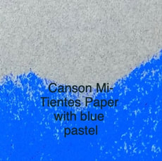
Canson Mi-Tientes paper is a paper used by artists working in pastel, charcoal and graphite. This paper is 160 gsm in weight, made from a percentage of cotton rag which is dyed in the pulp, machine rolled and acid free. It complies with ISO Standard 9706 and has no optical brightness additives but does have a mould inhibitor in it. So what does all this mean to us as artists? When I first started painting with pastel I used this paper. There wasn't the choice like today. This paper is still good value and I have been using it this week on a project so I thought I'd share this tip with you. This paper is 160 gsm in weight which makes it fairly light and strong enough to take a bit of pushing and rubbing with dry media, pastel in particular. I don't use this paper with water or wet stuff, though some artists do. It buckles really spectacularly and takes years to flatten out. One pastel I did in the early days on this paper is still showing signs of being whetted. It still has a sag in one part after all these years. Live and learn! You may probably already know this, or maybe you don't, both sides of the Canson Mi-Tientes 160 gsm paper can be pastelled on. One side of the paper is patterned with a chicken wire/honeycomb/tulle pattern on it. The other side is smooth. If you already use this paper here's the question, which side are you on? My preference is the smooth side as it takes more layers of pastel than the patterned side. The smooth side doesn't' show that chicken wire/tulle pattern after the painting is finished. On the smooth side, by using a light touch and layering my pastel stroke, I can do more. The tooth is deep enough to take up to 10 layers with a light touch and doesn't leave a pattern. The patterned side frustrated me as soon as as the chicken wire/tulle holes filled up, (the tooth), the pastel just slipped off, and it didn't take much for that to happen. This side is great if you want these patterns in your painting. I have a light touch for painting with pastel and this still didn't help much on the pattered side. The Canson Mi-Tientes paper is good value. It comes in 50 colours that are light resistant and ranges in tones from light to dark. It is a low cost paper, that comes in a range of sheet sizes, in a pad and including by the roll. Best of all it has two usable sides. If you haven't done so give it a try on both sides. There are no prizes for this and no-one is paying me to sell you on this paper. As I said earlier it was a paper I was using during the week and wondered how many of you know about this double-sided paper, and then of course, who uses which side. Feel free to send me an email, or leave a comment here to say which side you are on and why. with best wishes for all your paintings, Karol Oakley
1 Comment
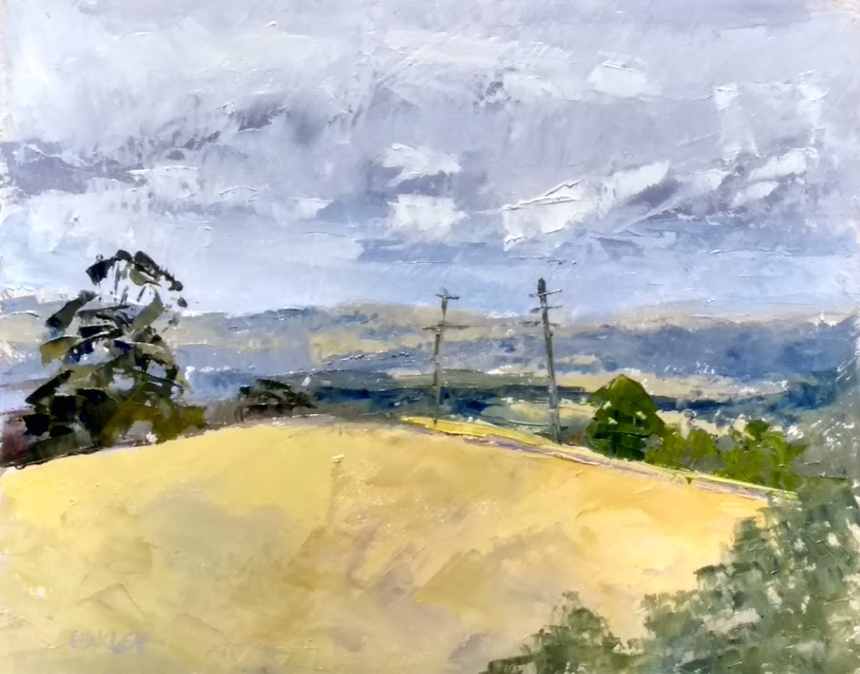
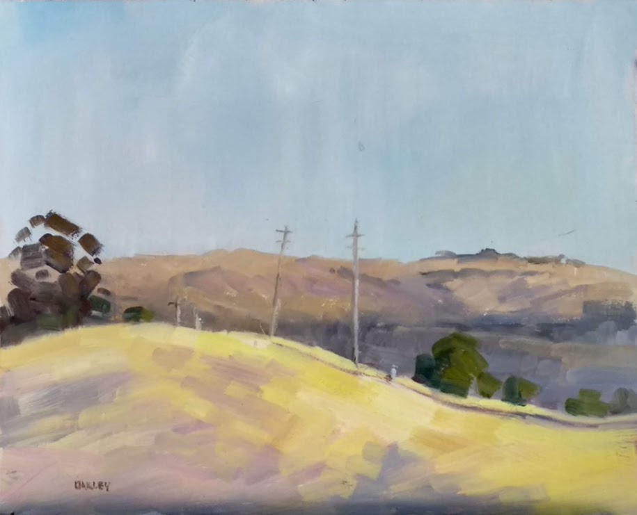
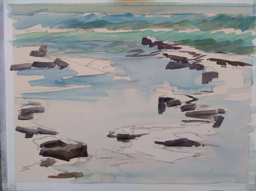
 an unfinished plein-air painting an unfinished plein-air painting Recently I was painting on the coast with a friend. we both finished our paintings at the same time. My friend was so happy that she had finished in under two hours. I was so cranky that I took that long. So the question has come up again, how long should you take when out painting plein-air? is there a time limit? The light conditions will determine the length of time spent painting, and of course we know this, but.... I like to think of Monet and his outdoor painting of hay stacks and water lilies. He would go back each day at nearly the same time to keep painting in the same light. 'Nearly the same time' as he knew that the light changes everyday just that little bit, getting darker later and lighter earlier in summer for instance. Monet would adjust his painting time to suit this by minutes or tens of minutes. What ever it took to get the same light and therefore the same colours, tones etc. We didn't have that luxury, we only had a short time frame and made the most we could of it. Todays plein-air painter seems to aim to get it all over and done with in one sitting 'allaprima' style. I'm not judging or commenting, it is only an observation. I am one of these allaprima plein-air painters. To do this though, I need to pick a window of time that suits the speed I paint. Like it's no good to me if I go out at sunrise to paint as I am to slow. A sunrise sees a fast change of light and needs a fast painter and a prepared painter. (and one who likes to get up early.... not this little black duck). There is no right or wrong on the time it takes to paint on site. As a guide it is said that two hours is the longest it should take. In that two hours the light will have changed, the shadows moved and the colours are affected. Painting from say 9am to 11am the sun is reasonably high in the sky in late spring and summer and early autumn. So the changes while noticeable are not unfavourable for the learner or the experienced painter. My friend and I started at 9:30 am and finished at 11:00am. We were painting at the beach in the scanty shade with a full blown onshore wind coming at us and getting stronger. I saw the light wash out the colour on the rocks, the tide come in and the shadows move and darken. Granted the conditions deteriorated, but the light remained fairly consistent for that first hour. The last half hour was misery. I fiddled and pushed and poked at the painting trying to make it improve, make it better. Sound familiar? Usually I allow one hour to plein-air paint with the proviso that it doesn't have to be a finished painting. This then lets me have the freedom to paint at the pace I want with out the pressure to finish. I can work with the light and if its not finished to bad. This gets back to the reason I am plein-air painting in the first place, and the is to learn. And you know what? Sometimes less is more in a painting. I'm happy with this plein-air sketch, I call it a sketch as it's an unfinished painting. Most times I am finished in one hour and this isn't to brag, it's to show you that with practice, the length of time it takes to do a painting gets shorter. There are some useful tips to help get to that shorter time.
So how long do you take for plein-air painting? Today's painting was done in one hour. (see below) I concentrated on the lemons, which is the focal point and what the painting is about. I didn't get a good background or even finish it enough, to bad. I said what I wanted to say, expressed the feelings of the zesty ready lemon and its green friend and that was it. Painting happy is my motto, do what matters to you and enjoy the process, in a shorter time!! best wishes, Karol 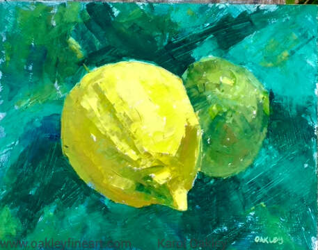 There has been no rain for longer than the 42 days that I have been plein-air painting each day. A heat haze and smoke in the air has kept the look and feel off all the paintings I have done, warm and hot. The dryness of the land is reflected in all the paintings until today. Today is different. A cold front and storm came through last night and washed the dust off, cleared the air and sparked an energy to all living things, so much so it's almost palatable. In 10 hours the grass has changed colour, ever so slightly, but it has changed. The sky colours are different, less red and more blue. Nature is amazing! My plein-air excursion was later today, 11am. The air is clean again it feels like a real spring day and not a summer day. It is curious to compare today's landscape painting with a 'yesterdays' from the 42 painted in hot hazy conditions. Painters who live in a more 'hectic' climate will be used to this change of light and colour. As weather conditions change these painters will be quicker to see, or notice this, or maybe not at all, as it is too fast a change? I'd love to hear from painters who live in this sort of environment as to how it effects their work. Plein-air painting has been a gold mine for artists wanting to learn by observation. We have all heard those sayings about 'the more you look the more you see' and 'learn by brush miles', they are so right. Observation is only one aspect of what we can learn from Mother Natures Academy. I'm putting up two painting photos today that show the difference a day makes. Yesterday was warm and threatening. Today is cool and damp. When I am painting my aim is to relate the feeling, the mood of the moment and of course the weather has a lot to do with that. What are your comments about these two paintings? (Use the turquoise comment box to the left.) THANKS AND HAPPY PAINTING, Karol Both are oil on board 10 x 8" The one on the left is a palette knife painting and the one on the right is made with a brush. PS: Both are for sale, and priced at AUD$200 each. Email me if you would like to own one or both!! at [email protected] Have you made a tone Bar?
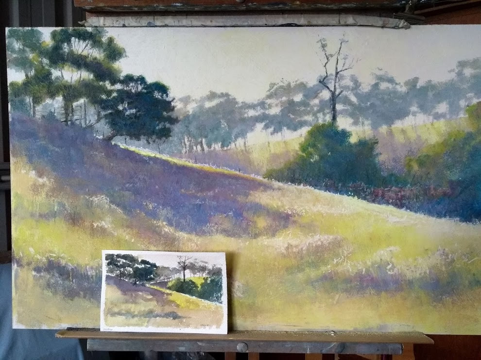
I made my first one in an oil painting class. It was the very first painting exercise we did. This handy tool has been used ever since. I take it to classes now to help others understand just what tone is and how it is used in creating believable paintings. The tone bar is used primarily to help the artist become familiar and friends with the amount of light to dark there is in a shape. Use it as a guide for comparison. It's good to say of a particular shape -" it's a light tone but not white" but really how do we make a consistent memorable comparison which we can discuss with others? This is why the tone bar exists in all its formats. Use the tone bar to measure by comparison. Compare the light to dark in a shape by holding the tone bar up and looking across from one to the other. Squinting is the best for this. Squinting shuts down excess light, it diminishes the amount of colour we see, leaving the grayness of a shape. To squint shut one eye and close the other eye until you are looking through your eyelashes (and they have no form). Notice how light to dark the shape is you can see through this narrow slit of vision. This handy little painting tool can be found on the sides of the commercial colour wheel, it can be bought as a separate tool made of cardboard and ready to use. There are so many variations in physical size and shape, the number of increments or keys on the bar and material its made from. The tone bar I use is a newer edition that I made myself. It's made on canvas so it's light weight, it is easy to handle and bend. My tone bar lives in my note book. There is also one for the studio, a bit larger and still made on canvas. Getting the tone correct is important to me, so that my paintings are believable and look right. I like to know that I have done everything I can to make my painting the best it can be. Tone is the cornerstone of this. 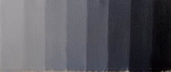 This month (September 2019) I am doing the plein-air painting challenge with Strada Easels. Now yes I would love to win a Strada Easel but really that's not the point of the exercise. I work in pastel nearly all the time as its my favourite medium. Every so often I like to play with oil paint too so this challenge gives me that opportunity to reacquaint myself with the lusciousness of oil and alot more. So what has that got to do with tone you may well ask? It doesn't matter what your medium of choice, the consistent painting tool we all need to be familiar and friends with is tone. Tone is the amount of light to dark between white and black. If you had of asked me what was tone when I started painting I would have looked at you blankly. I was very happily painting from photos I had taken and following along putting in the colours. Then when I started to get serious about my art I had a hard look at what I was doing. This prompted a change. I took notes for a painting when I was out taking the photos. I was looking at how light to dark areas of the scene were for future use in the studio, along with the photo. There came a moment when I realised that the lights to darks in the photo were out of alignment with what I was seeing in nature, with what I had recorded in my notes. I needed to check that what I was seeing was correct. But how did I do this? Enter the best ever painting tool for artists. The Tone Bar. This simple little bar with increments from white to black is a game changer. I made my first one in an oil painting class way back in the day. I then took it with me into the great outdoors and used it to check the lights to darks in nature. Then used theses notes in my painting and voila, my paintings started to look right. Today I am out in the great outdoors painting on site (en plein-air painting) each day as part of this September Challenge. I have my trusty little note book size Tone Bar with me. I am reacquainting myself with not only oil painting, but the most basic of painting tools. My outdoor paintings are being checked as I make them. The Tone Bar has helped me get it right and to become friends with tone. Have you got a tone bar? Special Offer just for you - www.onlinepastellearning.com 'How to Make a Tone Bar' Introductory price of $25USD Start now and make two tone bars, one for the studio and one for the notebook. 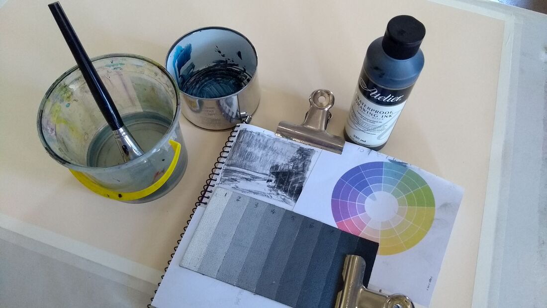 My note book size tone bar in use along with the on site sketch recording tones. Ever had a painting that you know there is something not quite right with it? I have been posting my WIP of a landscape and talking about the progress that I am making, albeit really slowly. ( it's on FaceBook Karol Oakley Artist and Instagram @KarolOakleyArtist) Today I had a another look and there is the niggling little something that says its okay but….. So how do we deal with this sort of thing?
Most of the time we are on our own when painting. We want an answer now. Deal with it now by going back to basics. Question your way through the basics until you find the problem. This sort of conversation with myself goes something like this…….
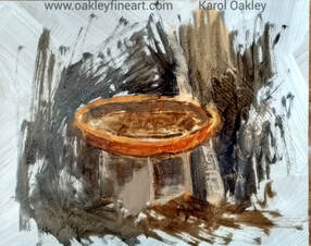
The basics of painting read like this for me. Composition is conception, Drawing is the bones of a painting, Tone is the muscle, Colour is the skin and Edges are the age lines, while Temperature is the mood. This is how I think of a painting and the parts that make it work. If one of these is not doing its job then it flows on to the other parts and lets down the whole. Tone My WIP has a problem and through this line of questioning the basics, I got as far as tone. I stood back and checked my reference, but more importantly checked my information on the thumbnail I did on site. I found my problem. The tone was just not quite dark enough in the foreground. Do you do thumbnail sketches on site to get the composition and the tones sorted? Most times it is something subtle the will niggle at you. Go through the question and answer scenario, use this analogy to help find your answer, then make the adjustment. Learning about tone is so important to a painter. Imagine if Leonardo didn’t know about tone when he painted the Mona Lisa she’d be flat faced cartoon. Make tone work for you, use it to show form, to show distance, understand how it works with the other parts like colour. The solution in my WIP was to go back and darken the tone in the foreground colours. It worked, and now that niggly feeling has gone. It may still need some more fine tuning and I will continue to question my way through all the basics, find the answer and try it out, see what happens if. I sincerely hope that helps you in your painting adventure. If and when you would like to do a detailed course on Tone in Art I have written one with interactive and a step by step guides. You will find it at www.onlinepastellearning.com  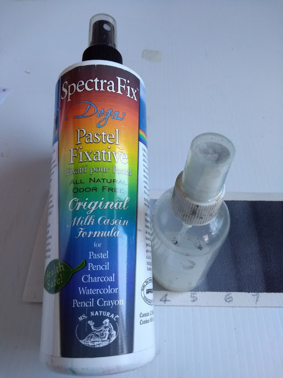 The workshop bottle of fixative is downloaded into a small spray bottle for easy use. The workshop bottle of fixative is downloaded into a small spray bottle for easy use. Often pastellists and oil painters start with the darks moving through the mid tones and out to the lights in a painting. Today I tried another way that I'd like to share with you. As a pastellist I have a selection of ready to go colours and tones with this medium. It is a quick way of painting plein-air.
As I set up I was studying my subject. I am looking for lights and darks, for the patterns and the rhythm. While I was doing this today I had a bottle of fixative rolling around that was getting in the way. Before I decided to throw it i realised I could actually make use of this in a different way of painting, well for me. Maybe it will resonate with you too. I have a bottle fixative I bought for a workshop demonstration, I don't use it in my every day practice. It was in my bag as a left over from that time and forever getting in the way. Maybe it was telling me something! So I adapted my pastelling method by starting at the feature point with the intent to use the fixative. Instead of starting with the darks, I started with the lights. I put in all the light tones, not the brightest most intense colours just the lights. Then I added the darker tones, not the darkest dark. Already the painting made sense. This was the point that I picked up the fixative and sprayed the painting so far. Why, when I dislike what fixative does to all those gorgeous colours and the lights? (it darkens them). I chose to spray so as to fix the pastel so far, then I could get in with the mid tones behind and in front of the subject with out disturbing the initial layer of gorgeousness. Is there such a word? I could run over what I had done and cut back to it with a small brush or eraser. It was easy to see where the first lot of pastel was, as the second lot that sat on top left a kind of speed bump, a visual tell tale. Finishing a pastel has never been easier!! I added the intense colours the brights and the mid tones, got in with the detail, the fiddly bits that I love in a painting, added more pattern and colour and voila it was done. Well most of it was. Standing back yet again, I found some extra dark could go on now, the darkest dark. Sometimes it isn't needed. Painting plein-air lets me see just how dark the darks are. Often their no where near as dark as in a photo. (And that's a whole different story.) Starting in the dark is not always necessary. As artist C.W. Mundy said "you are the director of your own show". You choose how to start and paint your piece. I found that starting at the focal point and with the lights, liberating and freeing. This method allowed me to create a more painterly painting as I was looking for tones and shapes. Using that annoying bottle of fixative made for a fun exercise, a new method of plein-air painting has come my way. Give it a try and see how it works for you. Let me know what you think about it by leaving a comment.  It is a beautiful sunny warm day and the wind is blowing with gusts up to 40km per hour. Do you go plain-air painting or not? Well it's a painting morning and I am going out, windy yuk and all. I have set my head and heart to be outdoors again today so taking a brave pill and an anchor I set off to find the most sheltered place to set up and paint.
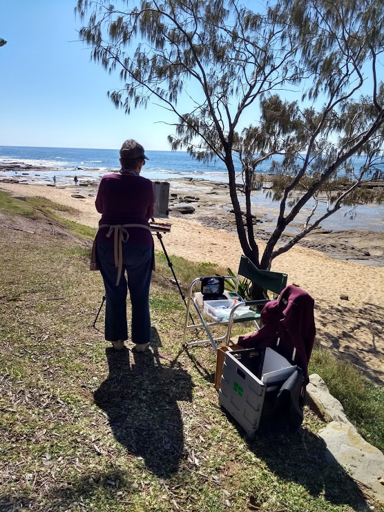
Nature supplies a lot of answers if you look. I have seen that animals will seek the most sheltered places to rest in these conditions, so that's where I looked. It didn't take long to find a patch of ground out of the strongest of the wind but not intruding on the local kangaroo population. These guys had the best spot and with the shade but being bigger than me I left them to it. Another indicator of a sheltered place is to look at the tree tops and watch the wind as it goes through them but not down on ground level. Watch the grass heads not bend and sway. Vincent VanSpot (the studio dog) came with me and found his ideal sheltered place in the sun with a small breeze. He and I both dislike the wind, you may have guessed that by now. Often with the wind comes a 'chill factor'. today we have the south south west wind so it is a cold wind. I'm standing in the shade and a breeze so it's about being protected by wearing the clothes that work for you. I wear a lightweight wind jacket to stop the breeze and keep me comfortable. It is easy to rollup and stash in with my kit. So I duly set up in this lovely sheltered nook, in some shade, and found a group of trees to zone in on for my painting. It is interesting that I went for the good conditions first and the motif second. Looking out for number one is a priority. There is usually something to paint and I make the most of where I am and paint something, even if it's not my fav thing. Plein-air painting is the objective, getting there and being comfortable are primary concerns. Use common-sense, don't let the weather spoil a good day out if there is some sensible way of staying safe. What are your pet hates about painting outdoors? Leave me a comment :) Painting 'En Plein-air' has to be the most vital part of a painters life. Some artists say it's going to life drawing, others say it's doing daily painting, whatever your sauce, get out and do it. I have just shared a most engaging week with 35 other plein-air artists from across Australia. This annual event has no prizes, no competitions, just the camaraderie of a group of likeminded people getting together to paint. We had a selection locations all researched with great views, toilets, parking and coffee the pre-requisites. Some did all of these locations while some painters did a bit of this and found their own unique locations. The Sunshine Coast Plein-air Paint Out is held in August each year and is in its fifth year. It is nearly to maximum capacity for registrations. This year saw the return of familiar faces, and welcomed new faces from across Australia. If you are at all interested then go to the FaceBook group of the same name to follow along and see all the posts and announcements. So now it's home and into a new routine which includes MORE plein-air painting. I know there is a group near me I can join in with. Or I can go out with a friend and plan a good time painting. What about you? What will you do to get out into the great outdoors and do more painting? For the next few posts or (more) I will be talking about this way of painting and the benefits along with the myths of going out to paint. If you are a studio painter, a lover of life drawing, or a daily painter read on anyway as there is usually something for everyone to glean. So what is your greatest challenge when it comes to plein-air painting? Leave a comment. :) ..................these photos are from last weeks SCPAPO  plein-air pastel painting set up using the #heilman box and holder on a camera tripod plein-air pastel painting set up using the #heilman box and holder on a camera tripod Painting outside is not everyones cup of tea. All sorts of obsticals can easily be found, all a sure way to stay in the studio. So just why do so many artists paint plein-air and rave about it? I can tell you about my first plein-air experience, it was exciting, hard work and with a dismal result of a painting. Even with all that, I loved it. I came back for more, now years later I still love going into the great outdoors to paint. What changed you might ask? Why do I paint plein-air ? It was the realisation that what I was seeing outside left a colour photo print for dead. There was so much more information available to me to use when I painted from life and outdoors. I could see such a wide variety of colour and detail that photos didn't show. Also the tones are vastly different in life than in a photo. There is such subtlety in the shadows to say the least. (Now how that all works is a story for another day.) A finished plein-air painting seems to have a look and a light in it, that studio work made just from photos can't equal. You would have seen this at exhibitions, art-shows and in the gallery. The work that is painted from life and/or 'en plein-air' is more alive, fresh, vibrant and inviting. This work is so different and easily picked as 'different'. It's in the look and more. While plein-air painting has 'that look', it has more, it also has a 'feeling' to it. You have noticed that right? Sometimes it's hard to put your finger on but its there. Paintings created 'en plein-air' not only find more tonal detail and more subtlety in the colours, they also pick up, for want of a better word, a certain feeling / emotion that then becomes part of the painting. Artists react to the energy and or emotion of a subject. This can be consciously or sub-consciously. It is this response to the subject, the artists way of interpreting what they see and feel, which makes a painting stand out. This is the 'why' of painting plein-air for me. It is all about reacting emotionally to the subject and using the painting tools of colour, tone, temperature and so on to describe what I see. It is about getting involved wholly and souly in what you are doing, being in the moment, totally absorbed, reacting, painting. That's the 'why'. This all comes with practice. Like any 'thing' we do it needs practice, repetition and consistency to go forward. That first plein-air painting expedition I did, was an eye opener. It was hard to see the tones, it was physically hard to cart all my gear a fair distance to the paint site, which I eventually found after walking in circles for ages. My result was a stilted study of colour and tone about a corner of a building. As I said earlier, I loved the freedom of finding this information and continued on with plein-air painting. There was so much to learn to start with and not a lot of help out there way back then. I'm talking pre FaceBook and YouTube days. Plein-air painting was not popular. It was something that a few did. I learnt form other artists and from reading and doing. Now days we have a huge selection of helpful articles, videos and blogs to show and tell us what we need to know. Why do you paint 'en plein-air'? And if you don't, it is time to try it out. There is an article in Australia Artist Magazine this month (August 2019) which I wrote as a guide to getting outside to paint. There are lots of tips and tricks included in this article, all to do with plein-air painting. I wrote it for pastellists but it can be generalised to be applicable to all media. This article talks about what equipment to take out with you and how to start a painting. Why paint plein-air? Not for any other reason than it will make you a better artist. You will learn to see, to have all your senses involved and bring all this back to the studio then into the works you do. Set yourself up to see what plein-air painting is all about, 'see what happens if...' my fav saying. Let's talk more about this in future blogs. best wishes, Karol 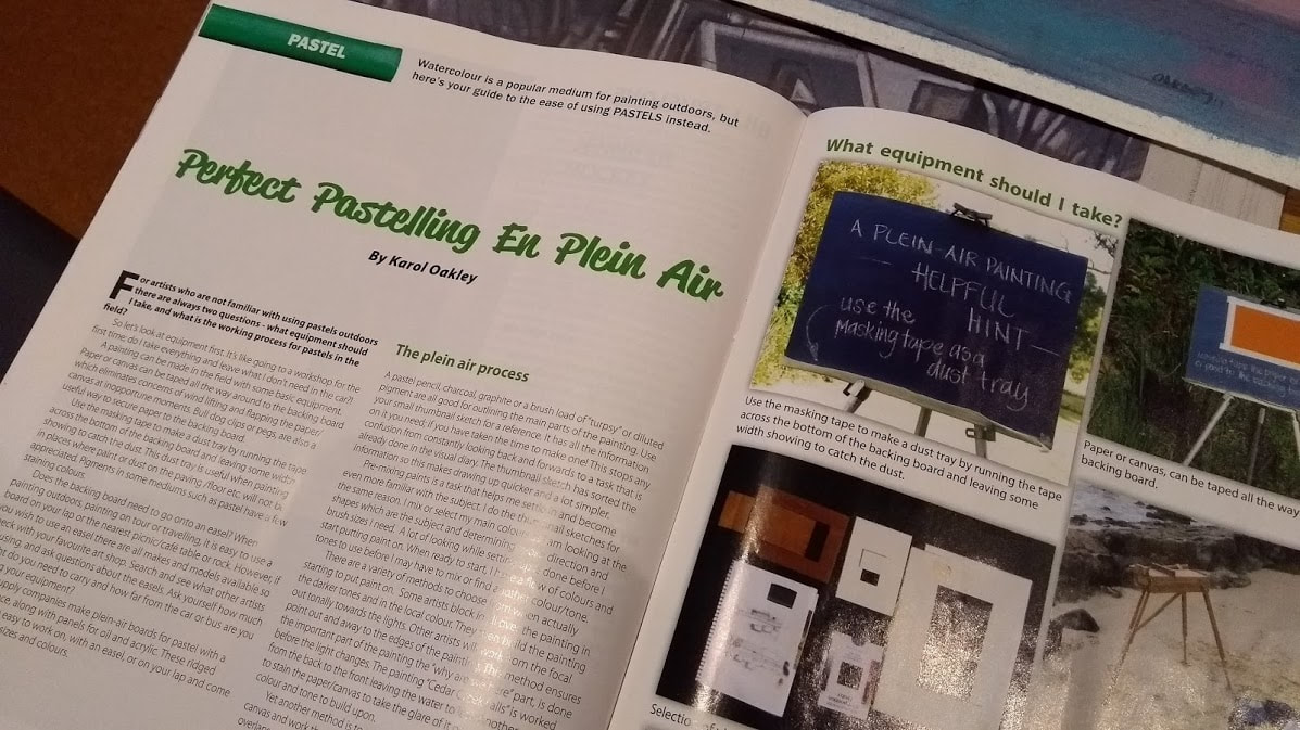 Excerpt from Australian Artist Magazine August 2019. 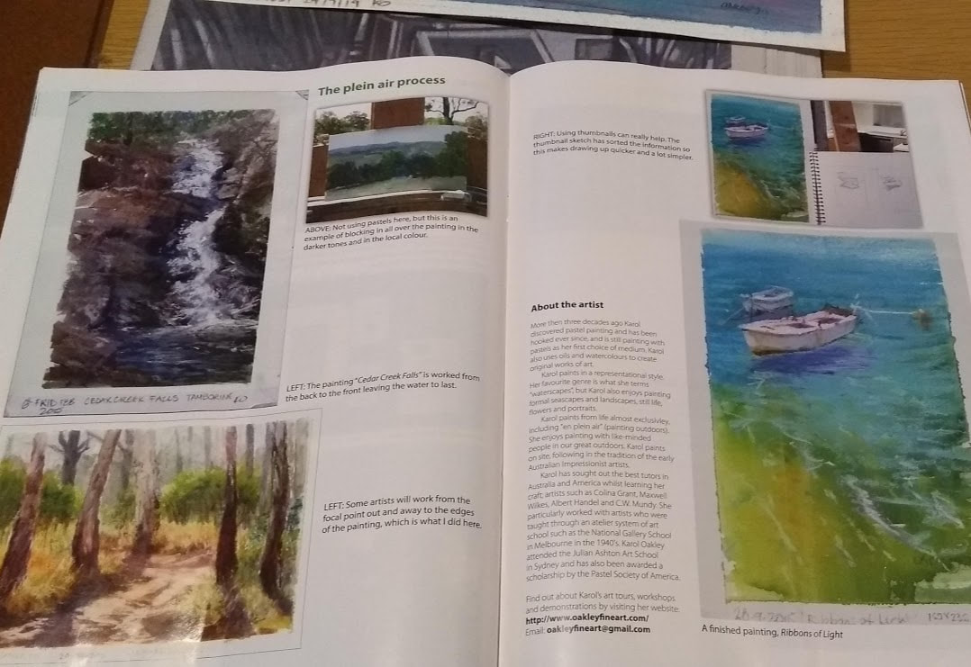 excerpt from Australian Artist Magazine August 2019 edition |
The Curious Artist Blog-
talks about everything and anything to do with painting. It's my aim to share techniques, tips, tricks, adventures, products, paintings, educate, inspire and foster the appreciation of painting. I welcome your feedback and questions and don't promise to post regularly, but to let you know when I do post . I'l give it my best shot to answer your questions and if I can't I'll let you know. Gee I may even be able to give you the name of someone who can answer. Either way this blog is about art, artists and everything to do with painting and drawing, being informative, heck maybe even inspiring, all aimed at making painting enjoyable. I sincerely wish you to join me on this adventure. best wishes, Karol AuthorKarol Oakley Archives
February 2023
Categories |


 RSS Feed
Karol Oakley is a Professional Artist and member of :
The Pastel Society of Australia (PSA)
Australian Guild of realist Artists (AGRA)
National Association of Visual Artists (NAVA)
Pastel Society of Southern California
PROUDLY AUSTRALIAN MADE
Oakley Fine Art is the registered Australian business for Karol Oakley Copyright Protected All Rights Reserved
The Pastel Society of Australia (PSA)
Australian Guild of realist Artists (AGRA)
National Association of Visual Artists (NAVA)
Pastel Society of Southern California
PROUDLY AUSTRALIAN MADE
Oakley Fine Art is the registered Australian business for Karol Oakley Copyright Protected All Rights Reserved
Proudly powered by Weebly